ReMeal
Product Design

Designing a nutrition diary for healthy-minded people to record meals without a hassle.

Summary

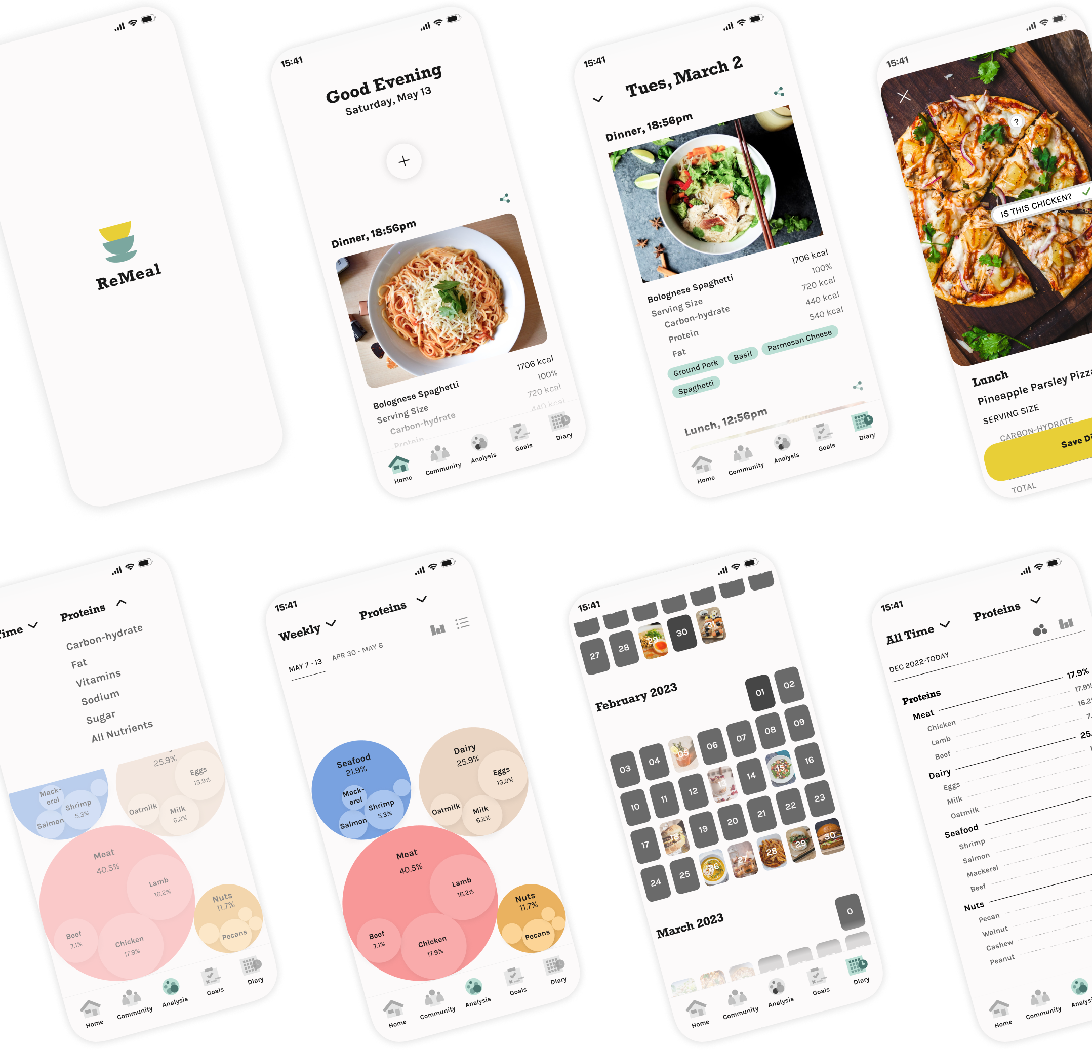
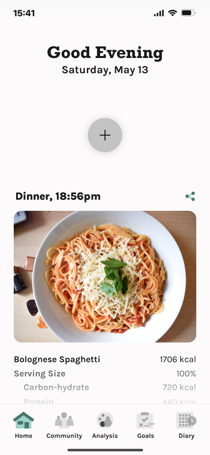
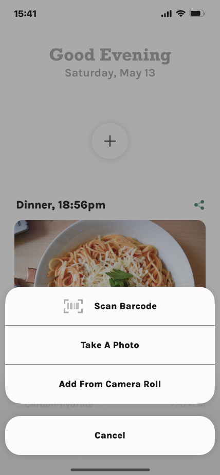
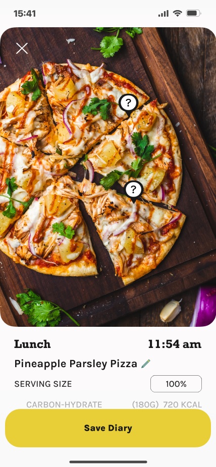
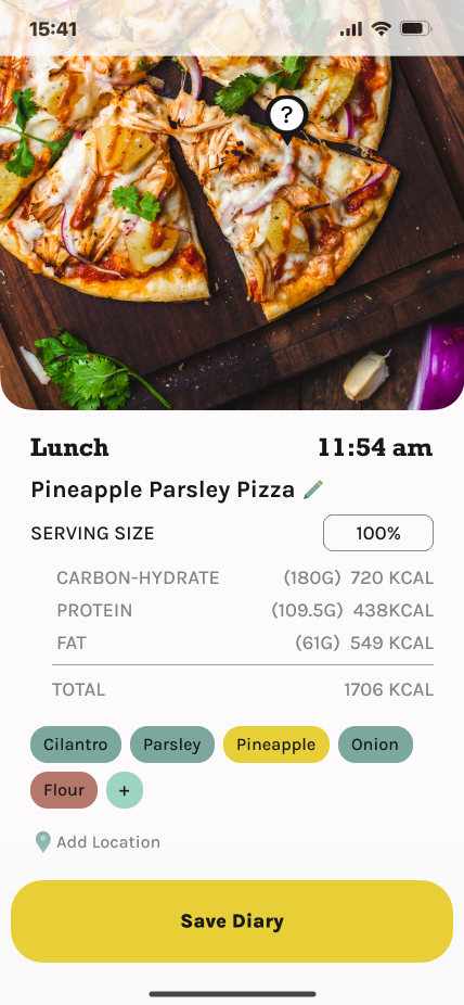
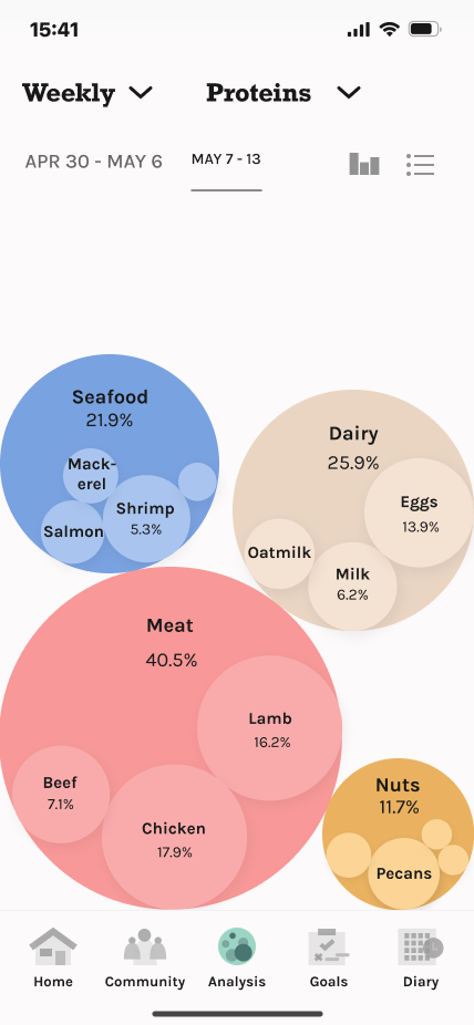
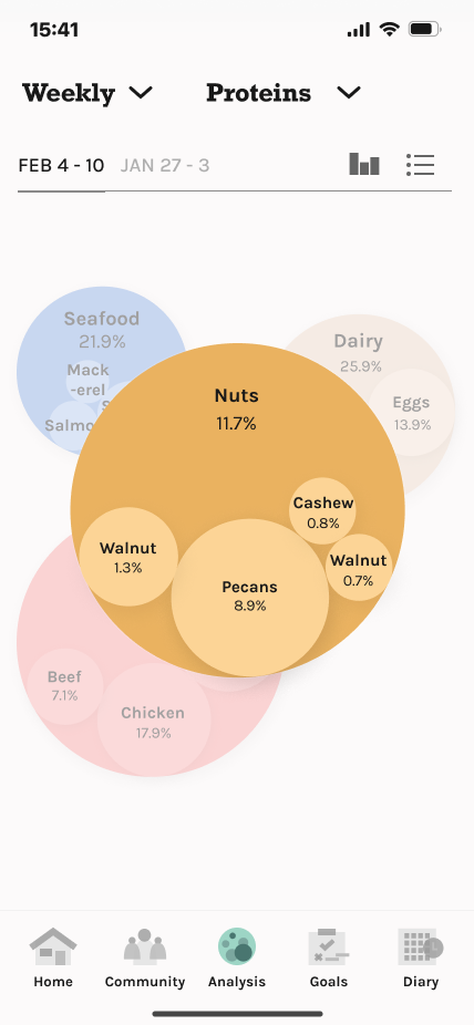
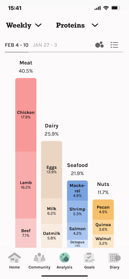
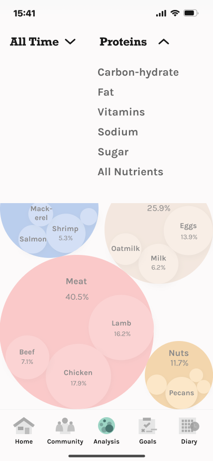
ReMeal is a meal diary app that uses image recognition to help users write food diaries and ensure nutrition balance.
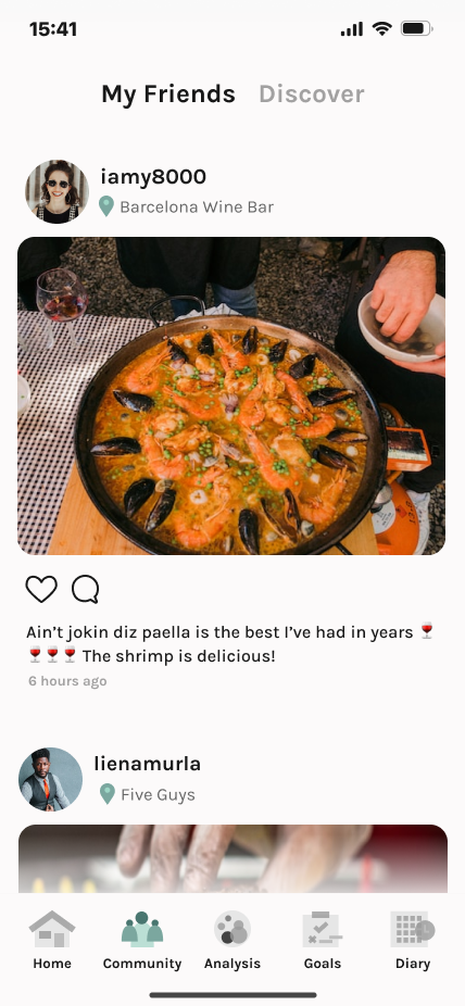
Targeted users are young adults from age 20-35 who enjoy eating for pleasure, and want to document and understand their meal pattern from their nutrition intake.

Timeline

Mar - May 2023

Role

UX Strategy
Product Design
Storyboard
User Flow
Prototyping

Teammate

Amanda Hamlet:
Root Concept
Wireframing

Deliverables

Product Plan
Storyboard
Prototype

8 ReMeal Interface Screens presented beautifully side by side.

Why

How can we make nutrition balance easier to track and achieve
when calorie counting is painful?

Unlike traditional food tracking apps that focus solely on caloric intake, ReMeal acknowledges that individuals have diverse nutritional needs and diet plans that aligns to their goals.

What

ReMeal allows users to effortlessly document their meals, gaining insights into their nutrition content without the pressure of calorie counting.

ReMeal help users align with nutrition goal and take pleasure in eating by prioritizing easy data input over calorie counting. Simple visualization helps users understand their nutrition information.

Design Process

Root Concept
Persona
Lean Canvas

Project Plan
Requirements

Target Audience

Task Analysis
to
Minimum Viable Product

Paper Prototype

Visual Design

Testing

Target Audience

Our audience consists of young adults (approximately 18 - 30 years old) who are interested in health, cooking, and/or nutrition and want to document their meals. More specifically, the characteristics of our target audience ranges from:

1

Fitness enthusiasts who track macronutrient intake each meal to reach my exercise goals and maximize workout performance.

2

Nutrition watcher
who want to maintain balanced nutrition from diverse meals and ingredients and avoid excessive nutrition intake.

3

Weight Loss Seekers
who want to lose weight healthily through controlled diet without the burden of manual calorie calculation.

Meet Brianna

Brianna is a nutrition watcher. She mostly cooks for herself to ensure she has balanced food source and nutrition.

She prefers her meal to have lots of vegetables, enough protein, and diverse food sources.

She is always keeping an eye on sodium and sugar of her food because she thinks they're unhealthy.

Latino woman preparing healthy meal in front of a clean kitchen

Core Task Analysis to Minimum Viable Product

Brianna's Goals: Core Tasks and Functional Features

1

Use camera to capture a meal.

2

View nutrition visualizations and food types

3

View a visualization of their nutrition and the types of foods users are consuming

4

View meal diary to review the food she had for the past few months

→ We then breakdown these goals into more detailed user flow.

Flow and Design

Add Meal Task Flow

Homepage:
Quick button to start adding a meal

Add Meal Options:
Scan food package barcode, take photos, or add from camera roll

Image Recognition:
Analyzes meal nutrition from image

Customization:
User adjusts nutrition data and portion size, add text for future references

A plus button on the top of the page for user quick accessUsers can add meals from one of three optionsPizza image will be analyzed by AI to document the ingredients and nutrition valueNutrition will be split into categories and ingredients will be tagged

Add Meal Task Flow - Demo

Stacked Bubble Chart
uses "size" to compare the nutrition intake amount.

Community Feed

My Friends
See what your friends are having, reply, and like their photos.

Use bubble chart to present nutrition information.  Ingredient that provide each nutrition amount from eachare represented as circles in a larger circle

Analysis - Nutrition Dashboard

Stacked Bubble Chart
is an interactive visualization of nutrition information to helps user their food composition.

Stacked Bubble Chart - Zoom
Tapping on a pie chart, users can investigate on a specific food type.

Stacked Bar Chart
is provides a visually more accurate comparison for users to know where their nutritions are made of.

Filter Selection
User can specify nutrition entry from a certain time frame or limit to a nutrition type.

A plus button on the top of the page for user quick accessPizza image will be analyzed by AI to document the ingredients and nutrition valueUsers can add meals from one of three optionsNutrition will be split into categories and ingredients will be tagged

Visual Design

Typography

This is Rockwell,
ReMeal’s display font

Rockwell's bold and robust design reflects the app's advanced features, creating a friendly and memorable identity. Its distinctive letterforms and visual impact make it effective for headings and titles.

Karla is ReMeal’s supporting font

Karla offers readability and versatility, ensuring clear and accessible information. Its clean and modern appearance conveys professionalism for presenting nutrition data visualization and content.

Identity Color

Interface Component Color

5.12

50817B

7.44

7BA79F

12.37

BBDFD5

11.34

E8CF37

9.41

3A446E

The color palette combines earthy, natural tones with vibrant accents, creating a harmonious and visually pleasing atmosphere. It evokes a sense of balance, vitality, and trust, resonating with users who value a nutrition-focused approach to their meals, promoting a fresh feeling while providing reliability.

Style

Headline

32px / 100%

Rockwell Bold

Heading 2

22px / 100%

Rockwell Bold

Heading 3

22px / 100%

Karla Bold

Heading 4

18px / 100%

Karla Medium

Heading 5

14px / 100%

Karla Medium

Heading 6

13px / 100%

Karla Bold

Body

16px / 100%

Karla Medium

CTA Button

20px / 100%

Karla Extra Bold

Supporting Colors

Data Visualization
Neutral Color

Key Learnings

Our Assumptions

Assumption of Data Categorization: We assumed that the current categorization of nutrition data is sufficient without validating its alignment with official guidelines or considering potential improvements.

What would I do Differently?

A lot of quick design decisions are made without a second thought and without validation from users or other perspectives.

Navigation/Information Architecture: Navigation page could examined: Maybe the "Community" page go after the "Goal" page in the navigation bar? Should I use "Analysis" or "Dashboard"? Next time, I would bring in second/third/more opinions as soon as possible to help me recognize terminology or design expressions I took for granted, especially regarding information architecture.

Data Visualization: I would start with understanding how to categorize nutrition data, making it more align with the official guides. I also noticed that a nutrition dashboard would be ultimately complicated over a period of time, and each ingredients provide more than one nutrition, making the data more intertwined. This would create more requirements when designing for this the data visualization.

Further Development

Information Architecture Review: Take a step back to review the information architecture. Evaluate whether the current structure effectively serves the users' needs and whether any adjustments are necessary based on user feedback or industry standards.

Research Official Guidelines: Dive into official guidelines related to nutrition data categorization. Ensure product aligns with these guidelines to provide accurate and relevant information to users.